The Cake Box
Case Study
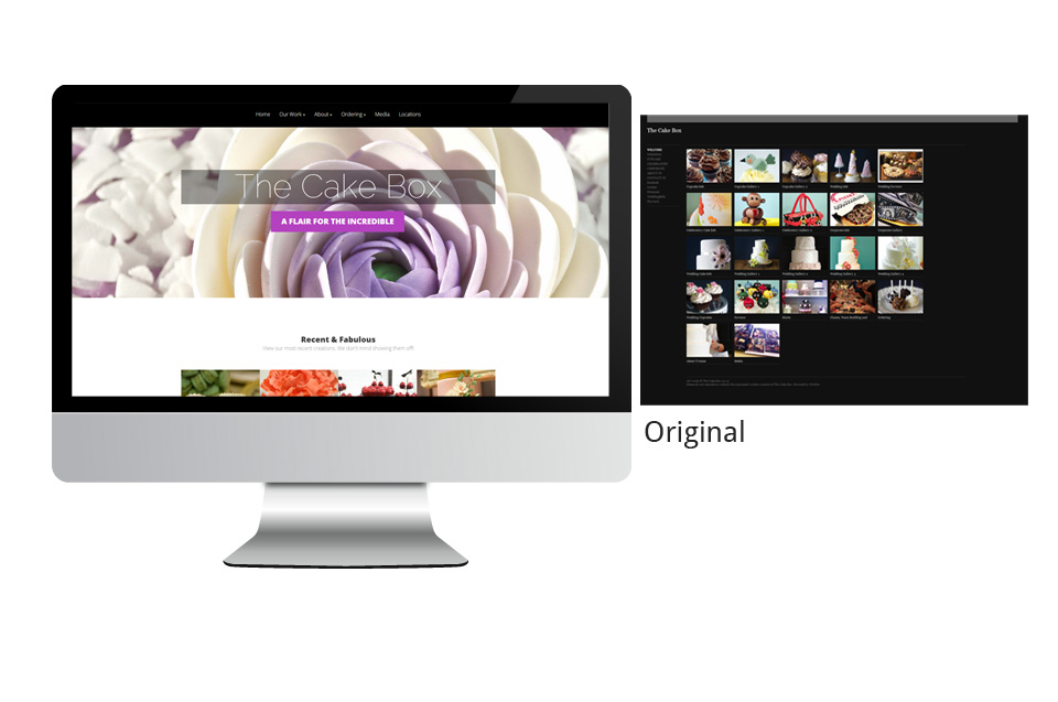
One such case is The Cake Box in Kitchener. I chose the Cake Box because their work is exceptional, and they had a variety of good quality images to work with. Since I started their remodelling project, they have made slight improvements to the website, but I still think the look could be improved.
I chose a responsive theme for The Cake Box. I’m not so sure that many viewers would be looking at the site on a smartphone, but possibly for some quick browsing through images or for the contact page.
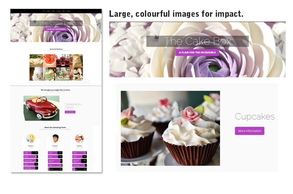
The called for a bold image for the header, and all the inner headers for more visual impact.
The site lacks colour, so I chose a hot pink along with their black colour, which has been quite popular for cakes recently. The WordPress theme allows for changing of colours, so as the trends change, they can always adapt.
The images are all still large and prominent, but the font treatment is bold where it needs to be, but also uses thin fonts for a touch of modern elegance.
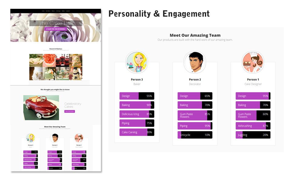
Because the current site is mostly gallery focused, I thought the site could use a more personal touch. By using a section to introduce staff, it helps make the business seem friendly.
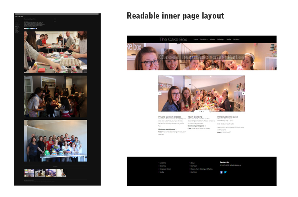
Their current site has very large images, which I think helps sell their product, but the actual content is dwarfed. They needed a way to balance the text content with the images while increasing readability. I did this by using tabs and accordions for content-heavy pages, while still keeping large images on the page.

